


CJSC Kirov Dairy Plant was founded in 1933. Leader of the Russian dairy industry. Every day it processes 400 tons of raw milk from its own agricultural firms in the Kirov region.
Under the “Vyatushka” Trademark, Kirov Dairy Plant CJSC daily offers its customers milk and cream, kefir and other fermented milk drinks, cottage cheese and curd products, and cheeses. The Vyatushka trademark has repeatedly won the title of People's Trademark. Production of dairy products from high quality raw materials. Many years of experience, the result of which is a high degree of trust and customer loyalty.
Task
Develop a packaging design for the entire assortment matrix, make the products more visible on the shelf and create a unified perception of the entire Vyatushka product line.
Solution
The Kirov plant will turn 10 years old in 2024. These are high-quality dairy products with a rich history that few producers can boast of. For a long time, they did not invest in brand design and communication with consumers, working on the principle of knowing the local brand among customers. But the time has come to attract a new audience and change the packaging design.
After an audit using our “Three Layers of Efficiency” methodology, it became clear that the current design is practically invisible on the shelf among other brands: there is no appetizing food area and bright, memorable elements. It was important to make Vyatushka dominate on the shelf.
Various specialists were involved in the work; in addition to our agency, expert Alexey Obzherin, founder of the Strategic Marketing Laboratory at the Skolkovo Innovation Center, and author of the book “Why is it better to buy from you? How to develop a strategic unique selling proposition".
Lyubov Suraeva, the head of the enterprise, and her team are passionate about their business and control the quality of the product at every stage. Every year, the Kirov Molokombinat participates in various all-Russian and regional competitions, in which the company’s products win prizes.
Alexey developed the USP for the company, emphasizing the history, personal brand and social responsibility of the owner of the enterprise, traditions and consistent quality. The era of faceless companies is passing. Nowadays people buy from people. For millions of consumers, it is important when a real person acts as a brand guarantor of their products.
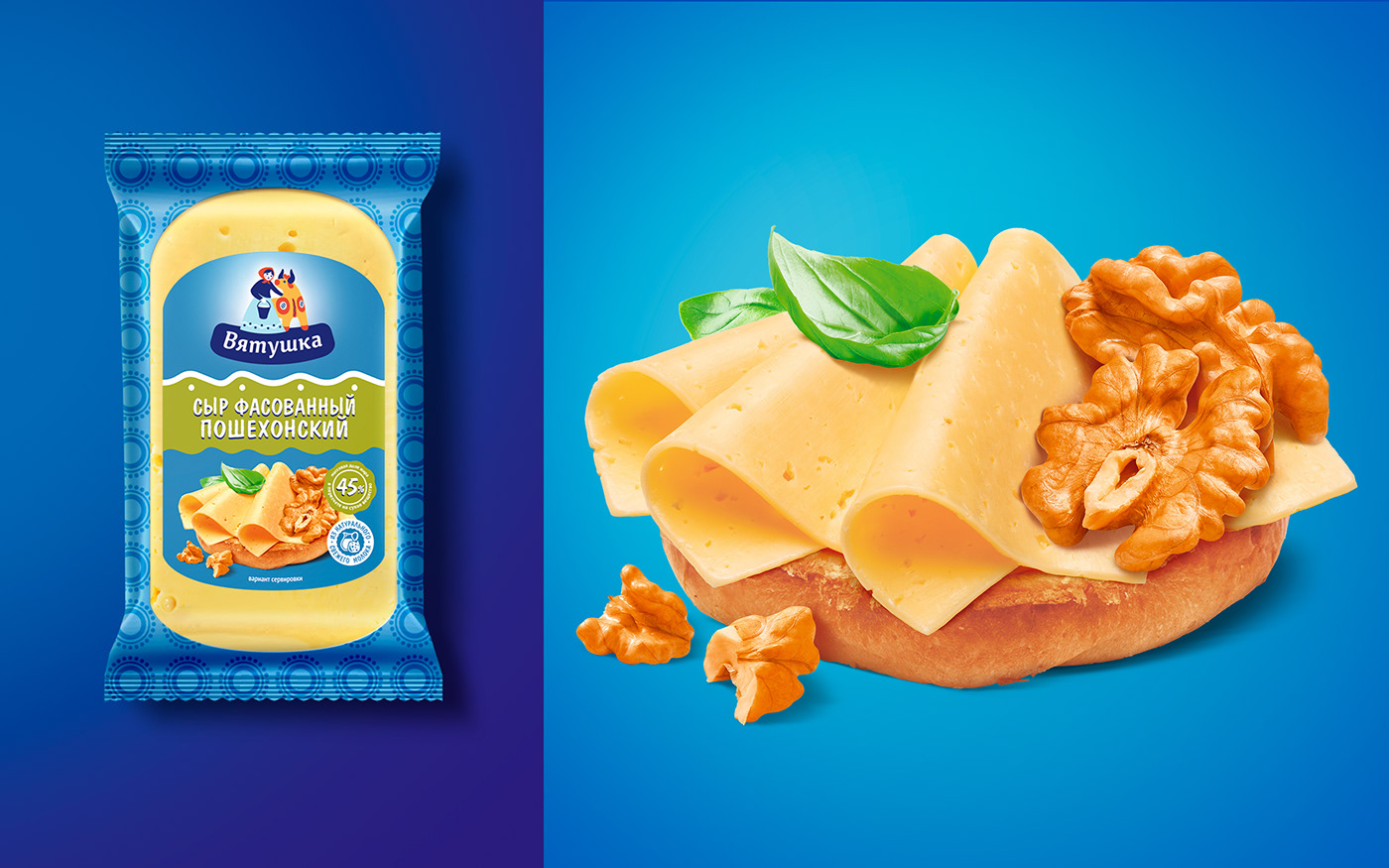
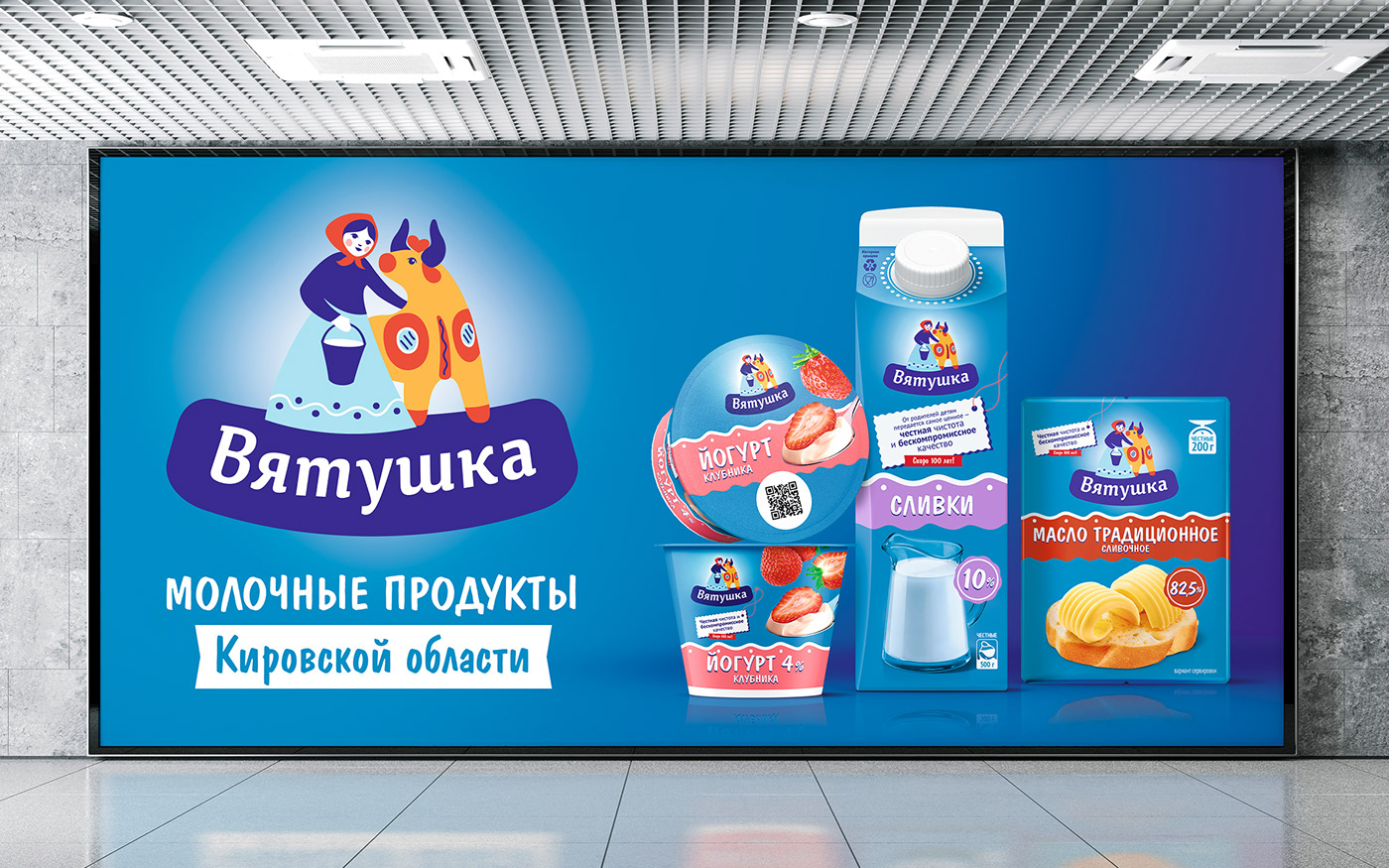
In the previous version, the packaging depicted a milkmaid girl in a headscarf, which had been an integral part of the packaging for many years. This girl is “Vyatushka” - a conscientious worker from Vyatka. Friendly, open and kind, she loves her job, cows and the milk they provide. Just as a caring mother is sensitive to the choice of what to serve on the table for her family, so “Vyatushka” shares high-quality dairy products with us with love and generosity.
We made her image more modern and stylish, adding a cow in the style of the Dymkovo toy, which is a kind of calling card of the Kirov region.
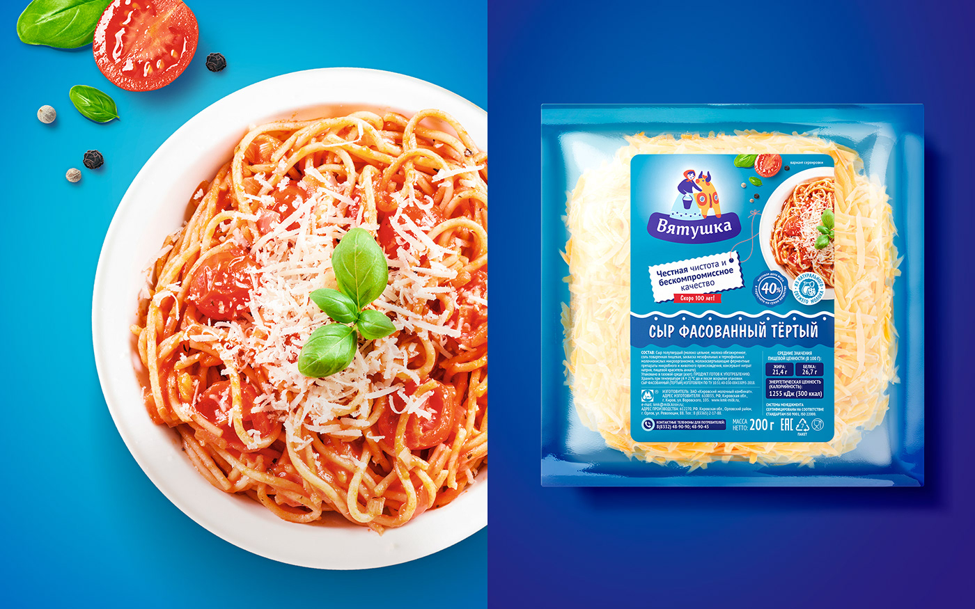
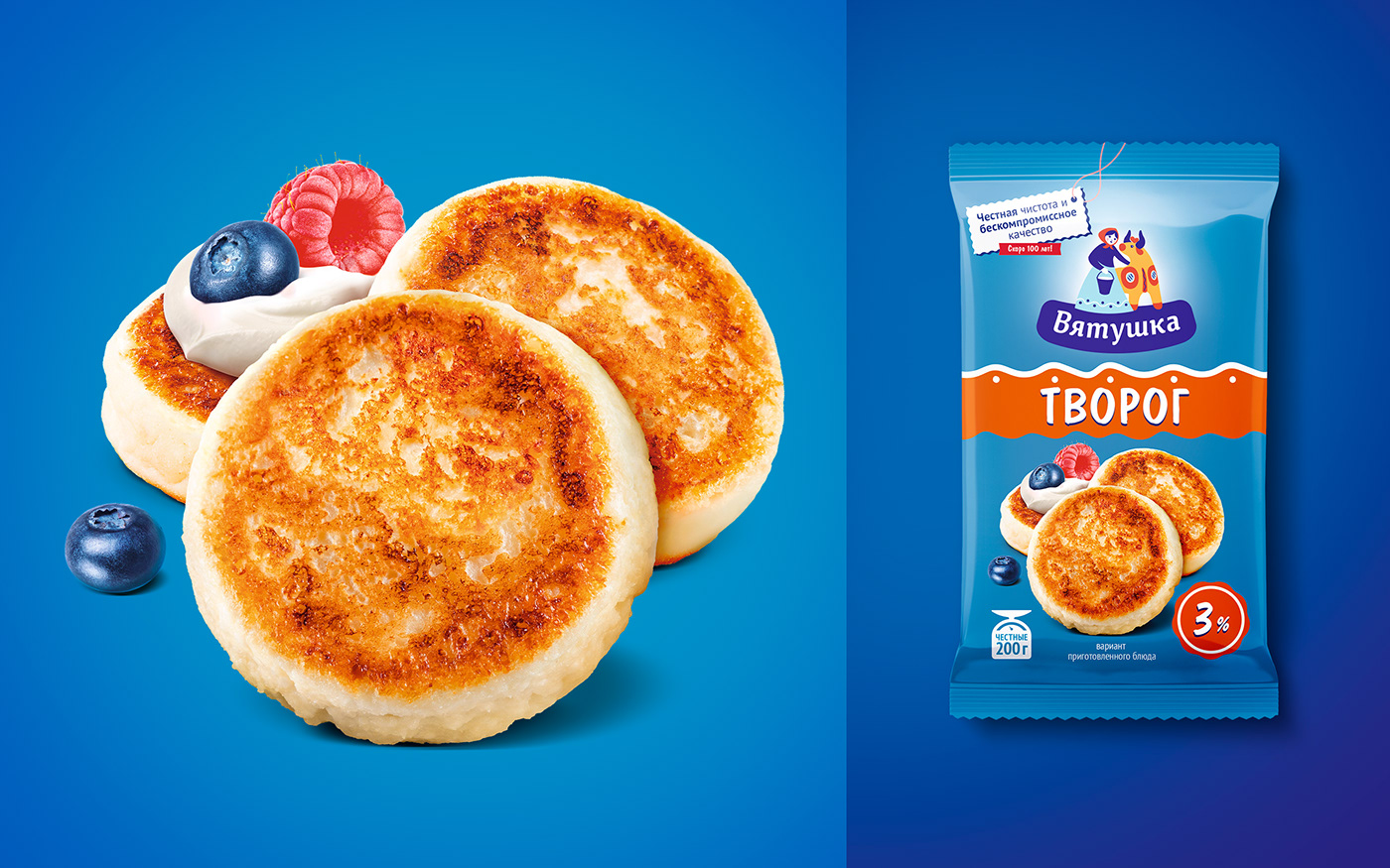
Above the logo appeared a block in the form of a stamp with an exclusive USP - a quote from Lyubov Suraeva about “honest purity and uncompromising quality.”
Differentiation within the line is provided by the unique wave color, which stands out perfectly against the rich turquoise background.
The presence of a brand color gives an advantage, as it creates a corporate block on the shelf due to the original rhythmic pattern with a wave and ornaments.


